Kitakar
Beyond Lashes & Brows: A Branding Blueprint
Explore the branding journey that transformed a local studio into a thriving, sustainable, and value-driven leader in the beauty sector, demonstrating a blueprint for long-term success.
Timeline: 4-Weeks | Completion: June 2025
Role: Brand Strategist, Product Designer

Emily Park is an ideal client persona for Kitakar. She is a 32-year old Marketing Manager for a tech firm and lives in Kitsilano. She has a Korean background and values natural beauty aesthetics.
📖 Context
-
Kitakar is a specialized studio in Kitsilano, enhancing natural beauty with expertly crafted lashes and brows for their clients. They focus on creating face-framing looks using customized, blended tints that perfectly complement one’s unique features and allure.
Operated solely by the business owner, Sonia, since 2018
Business and marketing done in-house
Offers eco-friendly products and service options
-
Emily Park: The Polished Professional
Age: 32
Location: Kitsilano, Vancouver, BC
Occupation: Marketing Manager at a tech firm
About Emily
Emily is a savvy, career-driven woman who values efficiency, quality, and looking effortlessly put-together. She lives an active, balanced life that includes early morning spin classes, navigating Vancouver's vibrant food scene, and weekend getaways to the Okanagan. She's always on the go but prides herself on maintaining a polished, professional image, even in a casual city like Vancouver.
Needs:Personalized expertise and flawless results:
Deliver customized, natural-looking, and safe facial enhancements
Tailored solutions that complements their existing beauty and fits their daily routine
Convenient and seamless experience:
Clients value their time
They want the entire process, from booking to aftercare, to be efficient, easy, and stress-free
Safety, hygiene and product quality
Visible cleanliness of the studio and tools
Transparent information about the products used
Technician certifications
Consultations around services and testing
Values:
Clear communication
Realistic outcomes
Highly skilled, certified technicians
Latest trends and techniques
Consistent quality
Intuitive online booking system (clear availability, reminders, policies, and aftercare instructions)
Assurances for safety, hygiene, and the quality of products used
Prioritized eye health and safety
Emily would choose your studio because it offers:Exceptional results that align with her natural, refined aesthetic.
Convenient online booking and efficient service.
Highly skilled technicians who prioritize safety and use premium products.
A relaxing, professional environment that feels like a mini-escape from her busy day.
A sustainable approach that aligns with her values.
-
Translating technical content and information into digestible and visual flows.
Enhance business and marketing flows into distinct streams: website, emails, and social media.
-
Developing a consistent brand identity with styled visuals elements for processes and marketing assets.
Optimizing online content into concise, value-driven messaging.
Streamlining content creation into a cohesive, multi-functional process for nurturing and connecting with clients.
-
Information Architecture
Define CTA Processes
Optimizing Visual Identity and Content
Streamlining Content Strategy
Elevated Customer Experience
🎯 Design Thinking
Below is the 3-step design process I applied for this project:
-
Developing a sustainable marketing system was paramount. Our goal was to provide the business owner with a solution they could confidently manage or delegate, ensuring they could strategically balance marketing efforts with critical operational demands.
-
We integrated multiple business processes and marketing flows into a unified system that seamlessly addresses diverse client needs and touchpoints.
These processes and flows includes: website, booking system, email list, social media (content and posts) and newsletter.
-
Clear objectives guided our iterative process, ensuring the efficient development of functional assets. The result: an integrated robust system consistently delivering high-quality, elevated visuals.
🌱 Project Walkthrough
By aligning with business needs and our target audience, this project effectively prioritized core processes and refined marketing flows for lasting sustainability.
I progressively designed 5 key areas (project scope), prioritized in the following order:
🏛️ Information Architecture
🗓️ Define CTA Flows
📱 Streamlining Content Strategy
🖼️ Optimizing Visual Identity and Content
💞 Elevated Customer Experience
🏛️ Information Architecture
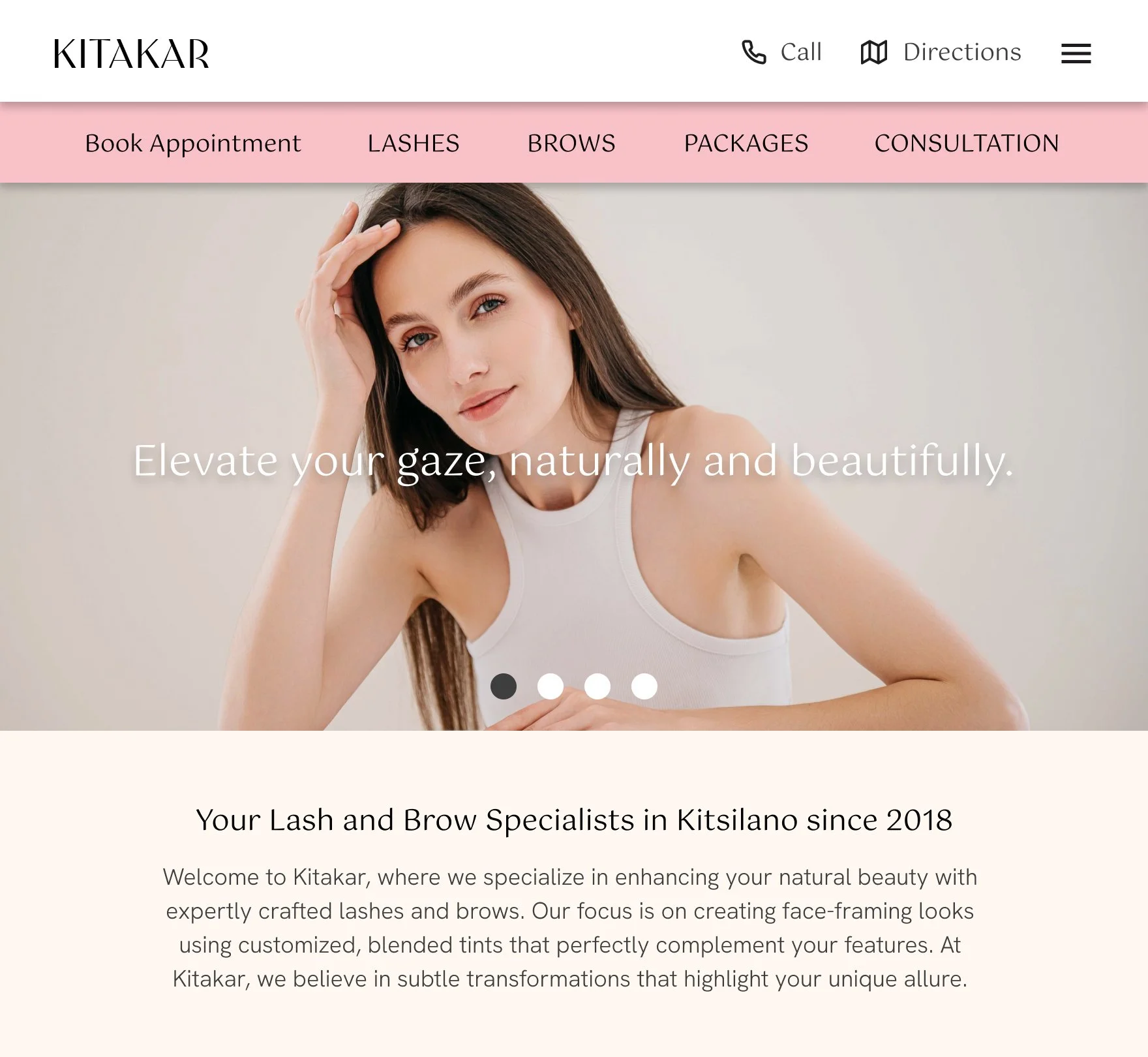
1—Researching the brand and re-organizing the current business website content for clarity and intuitivity.
While the website had core pages and sections, we focused on enhancing the user experience through intuitive navigation, streamlined page flows, concise content, and compelling visual elements like images, icons, and graphics.
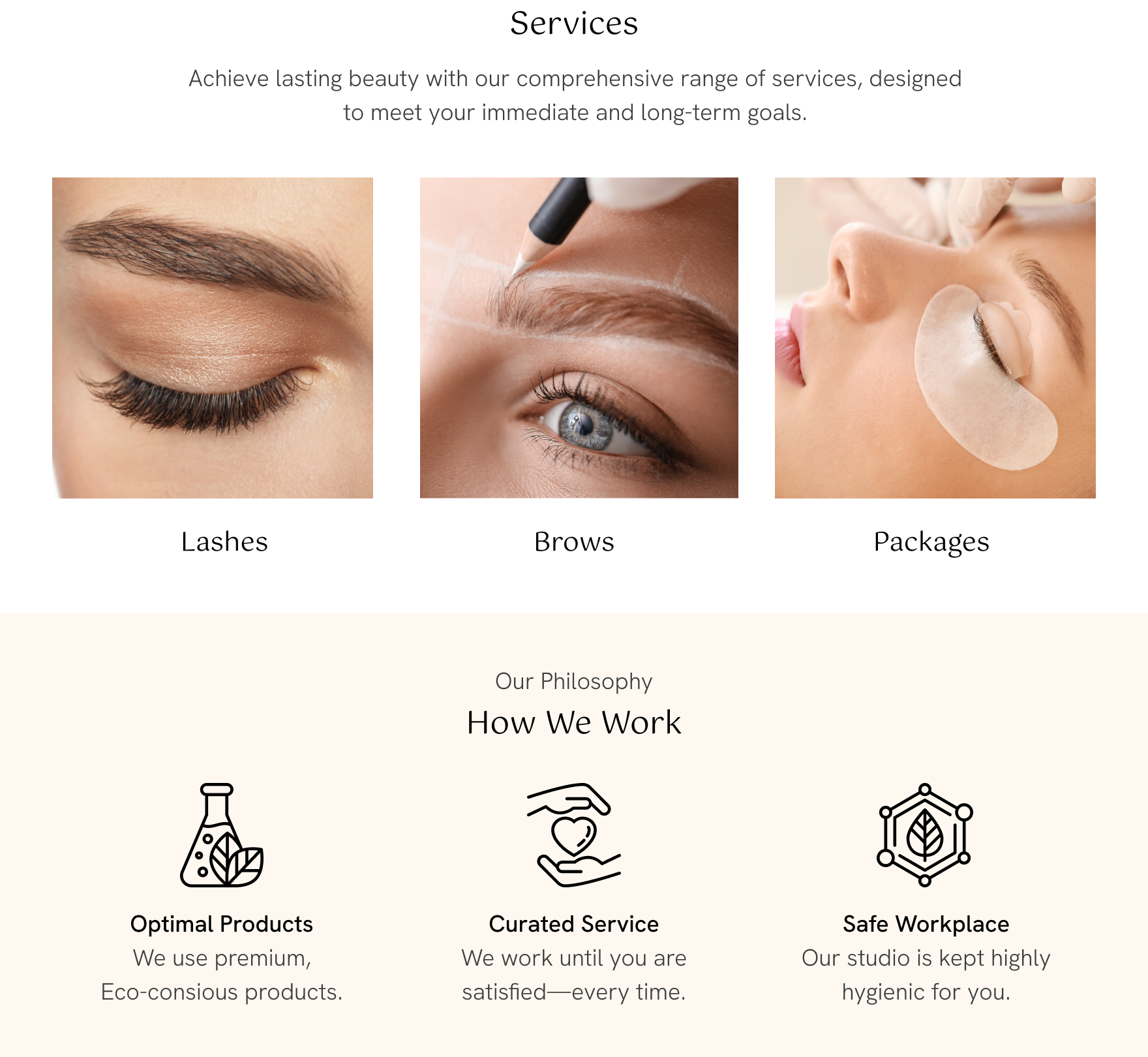
🏛️ Homepage
Highlight intuitive key actions: buttons with icons, and button under Book Appointment at the top
Spotlight key information in a clean and clear way
Assign visual hierarchy using scale, typography, iconography, and colour-blocking
Focused, relevant and concise content overall the website to keep users engaged with content
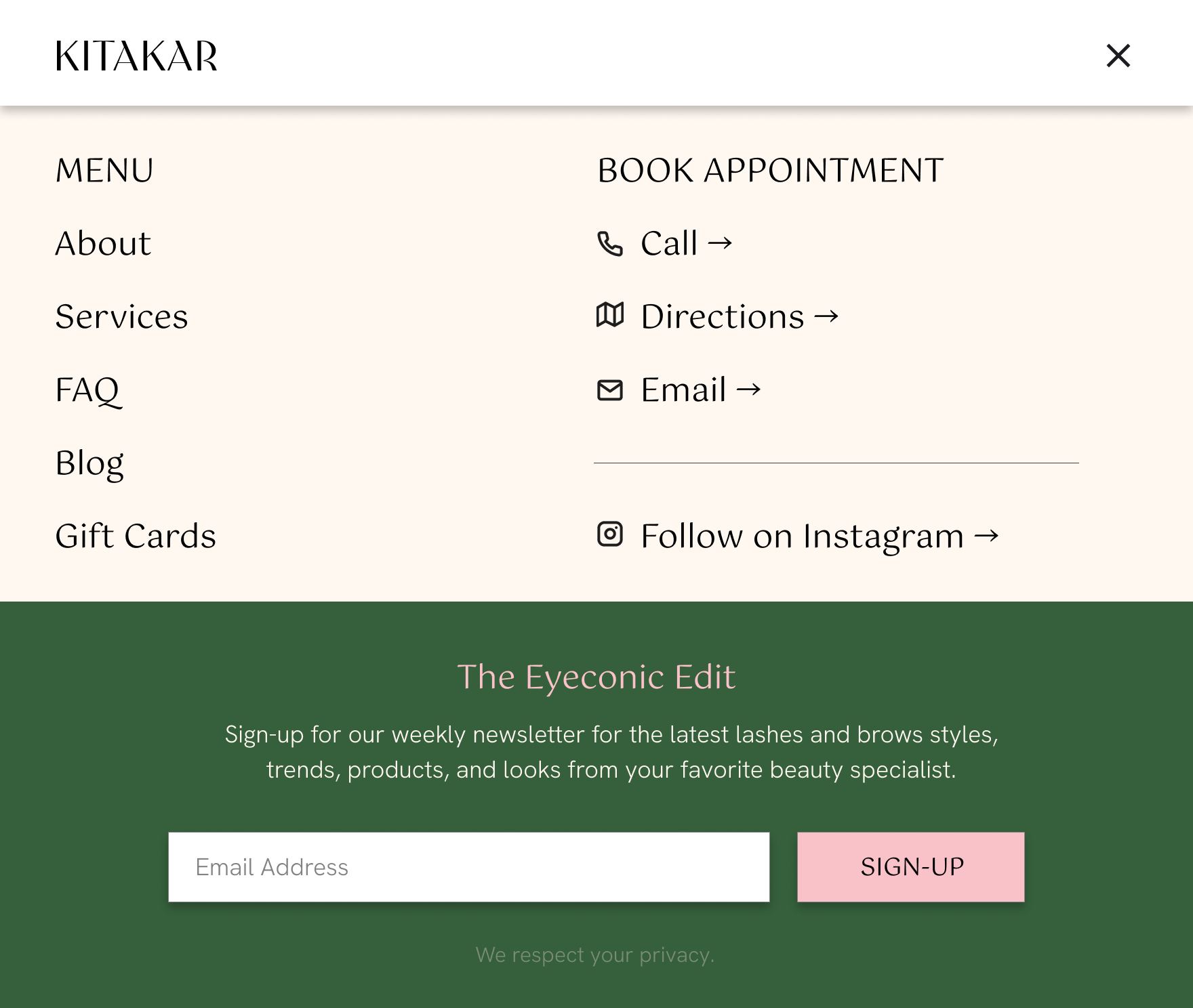
🏛️ Mobile Navigation
Intuitive mobile menu focusing on key actions (book appointment)
Icon usage for key actions to book and connect
Highlights sign-up section for weekly newsletter
🏛️ Mobile Homepage Sections
Main navigation: visually clean and simplified
Main CTA buttons: colour-coded in pink
Concise copy: for introduction/about section
Services buttons: use photos to visualize services
Philosophy graphics: visualize values using graphics to differentiate section
Testimonial cards gallery: neat and clear, highlighting client names and star rating
Newsletter section: segmented in green colour to highlight and differentiate
Informative footer: compiles contact information, blog link and Instagram link in a clean way

🏛️ Homepage Email List Pop-up
Pops up over the main navigation shortly after entering the homepage
Clean and visual aesthetics capturing brand style and look
Clear content hierarchy: large title, core message, and CTA
Highlighted CTA button in pink
Subtle terms and conditions with a little personality

🗓️ Define CTA Flows
2—Prioritize essential business processes, such as bookings and sign-ups.
To ensure vital sections stood out, we applied striking images, distinct colors, and thoughtful styling to CTA buttons. This creates a clear visual hierarchy, making user navigation both effortless and intuitive.
The complete services bookings flow consists of 5 touch points, in order:
Services Page
Booking Page
Confirmation Page and Email
Booking Reminder Emails
Thank you and Follow-up Emails
🗓️ services Page
Concise services intro copy
Segmented and visualized services for core info
Accordion menus keep information neat and scannable
Highlighted buttons add visual weight to key CTAs (pink + drop shadow)
Highlight prices of packages and promos for transparency
Colour-blocking to group and organize sections
Client feedback adds credibility to services and experience
Newsletter section in green highlights sign-up
Footer completes the page with links to the blog, Instagram page, and contact information

🗓️ Booking Process
Booking steps highlights current on the top bar; inactive steps in grey
Add-ons section beside the order summary for quick additions
Schedule using a calendar and availability in with time slots (buttons)
Client information: minimal and essential information for a quicker process
Extensive terms and service section in a checklist and form layout
Color-blocking to group sections (visual breaks from the over process)
Booking summary: highlight price so there is full transparency with clients
Payment options: “pay now” highlighted to encourage payment upfront; pay without booking option available to encourage booking completion

🗓️ confirmation page
Clear confirmation page: date, time and service
Add booking to email calendar options
Provide contact information for any booking questions, concerns, canceling, or rescheduling

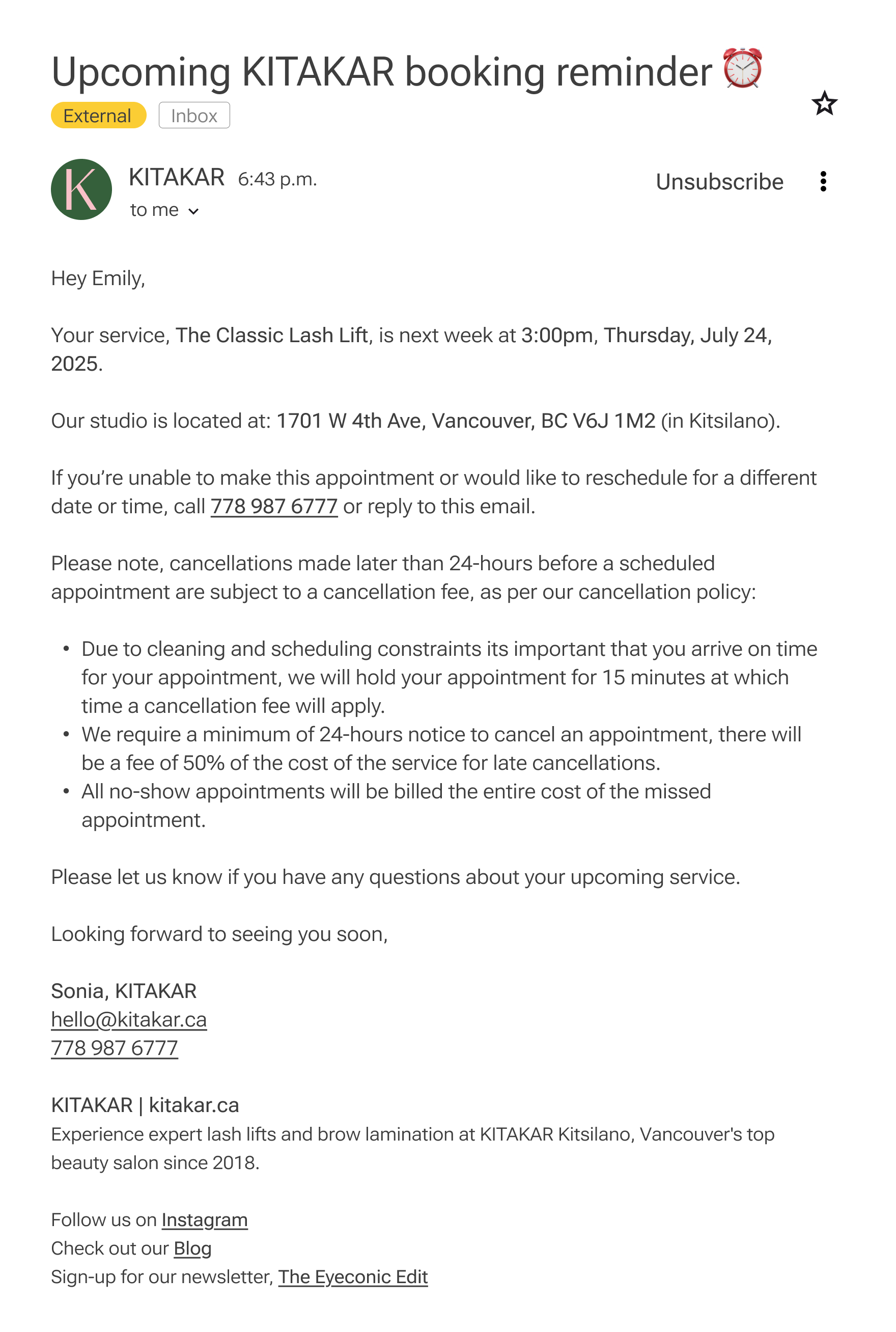
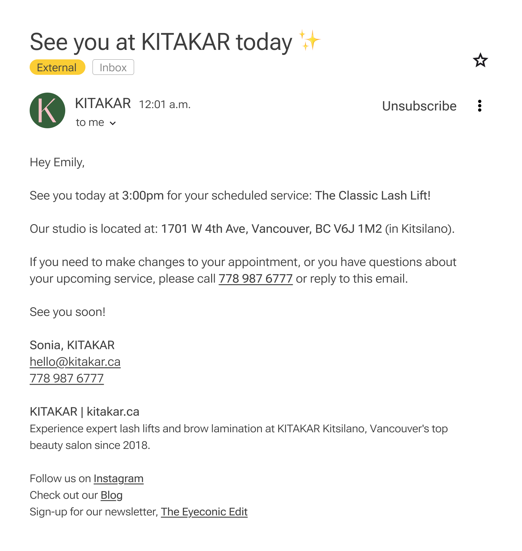
🗓️ confirmation Email (Gmail)
Informative and concise email subject with visual icon (stand out from other emails)
Personalized with client name
Booking information with cancellation, terms and conditions, and other contact links
Contact information for any booking questions, concerns, canceling, or rescheduling

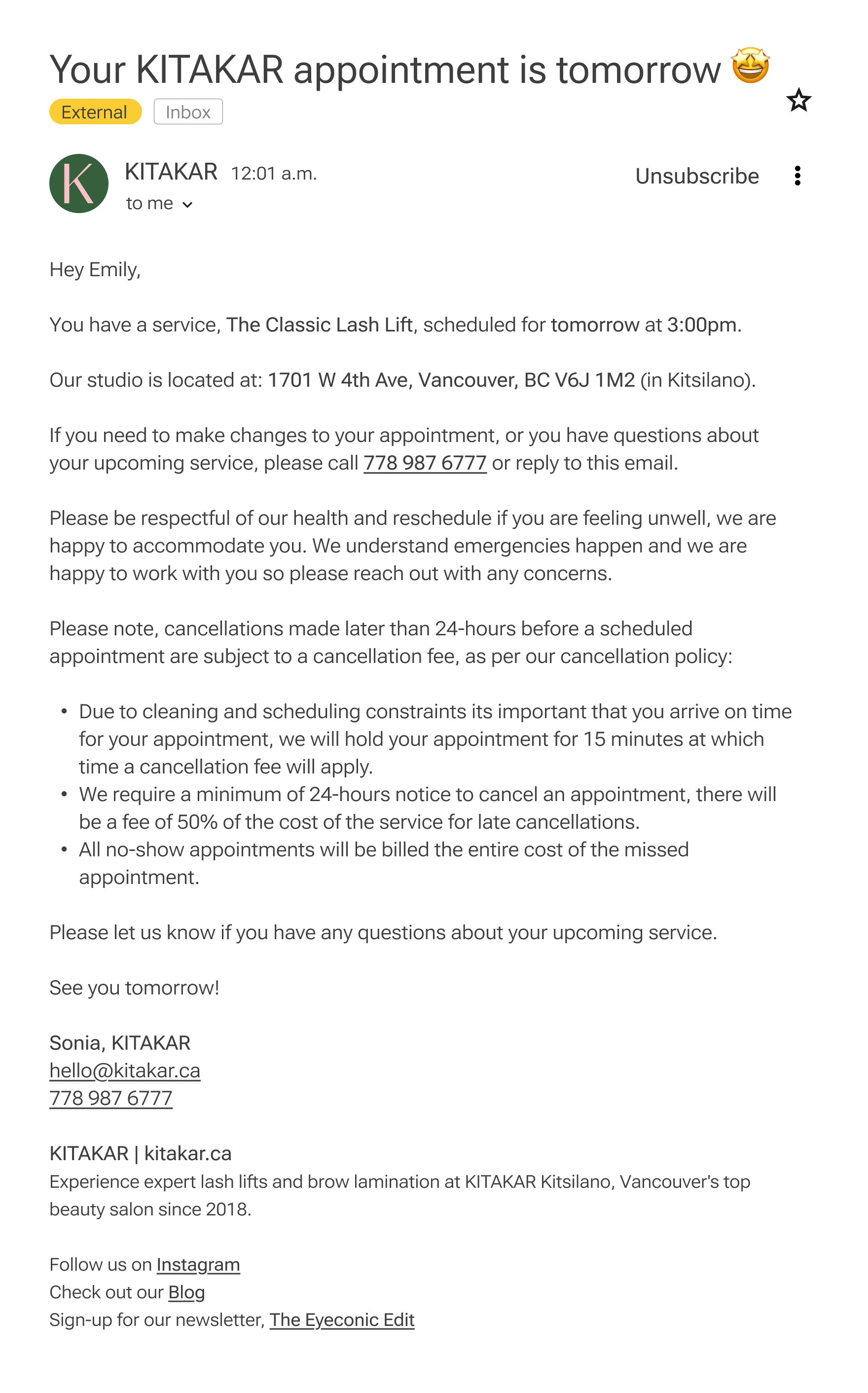
🗓️ Booking Reminder emails
There are 3 reminder emails that are scheduled to be sent to clients until their booked service:
Email Reminder 1: Send 1-week before booking
Email Reminder 2: Send 1-day before booking
Email Reminder 3: Send day-of booking
🗓️ Thank you + Follow-up Emails
Say thank you for visit and business
Ask for feedback and client experience
Request a Google review
Complete email with thanks and gratitude

🗓️ Next step: recommendations
Below are recommendations to further nurture the user experience:
SMS text reminders for direct contact with clients (can automate booking confirmation texts)
Personalized client email flows for birthdays, seasonal, and holiday promotions
Mobile app: profile login, rewards and loyalty program
Promotional email campaigns for special/seasonal deals or events
📱 Streamlining Content Strategy
3—Crafting marketing content to nurture and engage clients on various platforms.
By developing content pillars around topics our ideal clients seek to inform and assure themselves, we further position the brand as professional, approachable, and empathetic.
-
The 5 client touchpoints for Kitakar and their assigned core objectives:
Website: about the business and brand, services, and brand visual aesthetics
Email List: direct and professional contact with clients to share business promotions
Newsletter: share insights and trends, educate clients, and build trust through value
Social Media: visual, high-impact designs to attract new clients, maintain and delight current clients, build positioning as a local beauty expert
Blog: Share technical expertise, tell authentic stories and perspective, provide value through insights and information in a personal way (humanizing, relationship building)
-
The 4 content pillars were informed by user needs (information, trust, health, safety, value and exceptional service and experience):
🩷 With love, Sonia
Personalize, humanize communication with clients
Share insights personal and professional to build trust
Educate and share valuable knowledge to position as an expert and authority that clients can trust
📈 Trends
Keep clients in the know with the latest tips, styling, aesthetics and techniques
Guide and educate clients through trends
Explain and share industry standards to keep clients informed
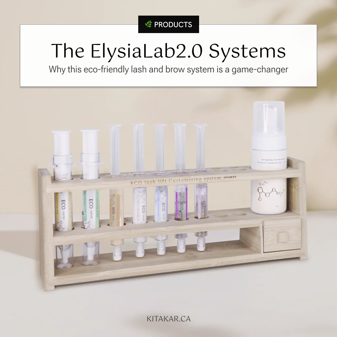
🌿 Products
Educate clients about products so they stay healthy and safe
Share genuine insights (builds influence)
Navigate clients among eco-friendly options (be an informative and trustworthy voice)
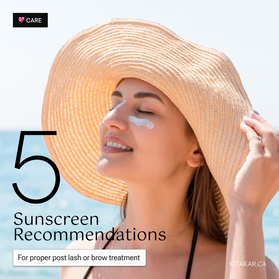
🫶 Care
Deliver valuable and memorable client experiences to build trust and loyalty (lead to referrals)
Share helpful and valuable tips to create a sustainable relationship with clients
-
There are 7 steps from developing to posting content:
Research topics that interest clients (trends, products, and feedback)
Organize topics into content pillars categories
Develop content, prioritizing relevant, comprehensive information
Select imagery to relate to articles
Feature articles in the newsletter: clients signed up get the exclusive first peek
Upload articles to blog: users can comment and share; search and archive blog
Notify on social media about blog and link articles (Instagram)
📱 website
Purpose: Professional and formal online business marketing tool
Market: services and share story, testimonials, insights, and contact
Key CTAs: Booking, sign-up (email list + newsletter), read blog articles, follow on IG
📱 email List
Purpose: Gather client contact to reach and connect with them directly
Professional contact: message about bookings, promotions, business updates.
Personalized emails: client names, preferences, and birthday gifts/deals
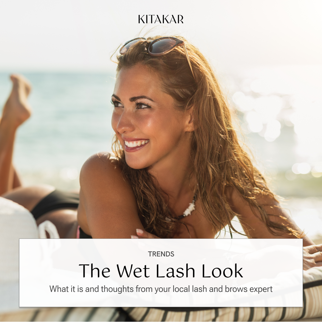
📱 The Eyeconic Edit Newsletter
Purpose: Nurture and educate clients directly with exclusive insights (direct relationship building + positioning)
Topics organized into sections based on content pillars that interests clients
Notify content length with time icon (content kept short and sweet)
Images break content and signal new topic (bright, fresh, natural photography)

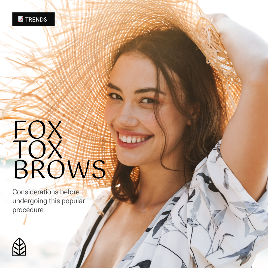
📱 Social Media (Instagram)
Purpose: To attract clients interested in fashion and beauty
Editorial aesthetics: visually attract target clients
Use templates to look both cohesive yet with variety based on the content
Categories highlighted to stay organized and increase scannability

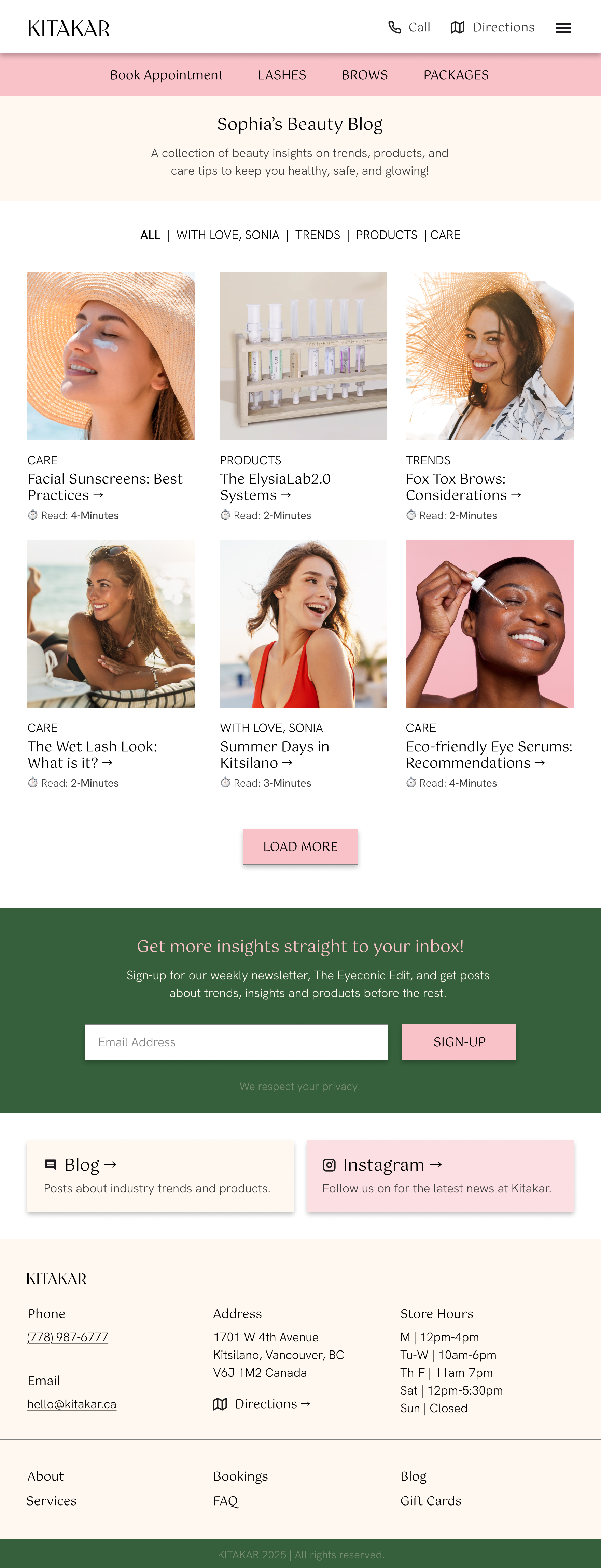
📱 Sonia’s Beauty Blog
Purpose: To educate and address beauty topics, interests, and concerns clients have; position as an expert and leader
Topics organized into sections based on content pillars that interests clients
Sub-navigation to view all posts and search specific blog topics
Archive blog posts: link blog through social media and newsletter
🖼️ Optimizing Visual Identity + Content
4—Edit and systemize content with icons, colours, and styling.
With a focus on attracting our ideal clientele, the brand elements are intentionally styled with clean, refined aesthetics. All design choices were made to ensure a seamless and efficient user experience.
Design aesthetics keywords are:
Clean
Professional
Curated
Refined
Intentional
🖼️ Kitakar Brand
Logo: refined and elevated aesthetics
Colour Palette: light, neutral, and natural
Fonts: feminine and modern
Icons / Graphics: clean and sleek
Imagery: bright and high-quality
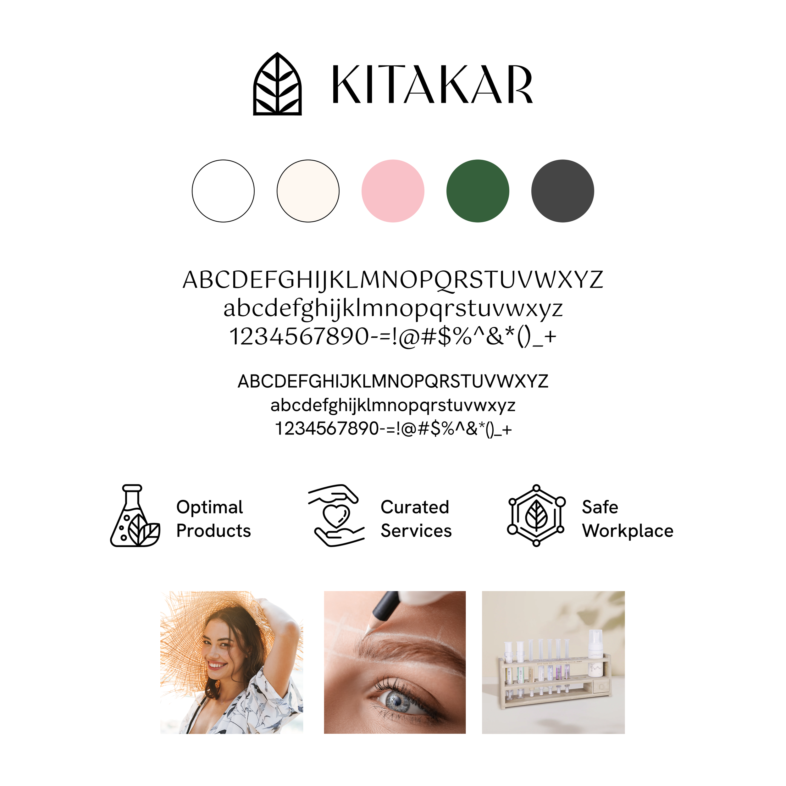
🖼️ LogoMark rationale
Arch: unique, iconic shape; arch connects to brow arches; versatile brand shape (pattern usage)
Window: open, freshness; transition, passage (new look)
Leaf: natural, eco-friendly, sustainability
Clean and bold lines: professional, subtle, aesthetic

🖼️ WordMark rationale
Unique name and editorial font style (all-caps): elegant, stylish (beauty + feminine look)
Sharp lines: sleek, contrasting, + professional (fashion aesthetics: ex. Vogue)
Contrasting lines: similar to sleek look of lashes and brows

🖼️ Website Sections
Services:
Concise blurb: clear and descriptive
Photo buttons: visuals used to emphasize services
Philosophy:
Iconography is used to visualize values
These values correlate to what matters to clients: safe, quality products and services for sustainable results
🖼️ The eyeconic Edit Newsletter
The Eyeconic Edit: clean, modern style to contrast yet pair with brand logo
Eye-catching title based on weekly topics/newsletter
Topic/category titles to break and introduce sections
Applying colors from imagery to highlight content and keep weekly designs fresh

🖼️ Social Media Instagram Posts
Versatile templates to look both cohesive yet with variety based on the content
Categories highlighted to stay organized and increase scannability
💞 Elevated Customer Experience
5—Transforming the end of an appointment into a memorable experience with a complimentary aftercare kit.
Every client touchpoint, from discovering the brand to the completion a service, is further enhanced to reflect our thoughtfulness and care.
💞 personalized aftercare kit
Purpose: Transforming the end of an appointment into a memorable experience, with a complimentary aftercare kit
This aftercare kit includes:
Aftercare Booklet
Thank you + Feedback Card
Travel-sized Aftercare Product

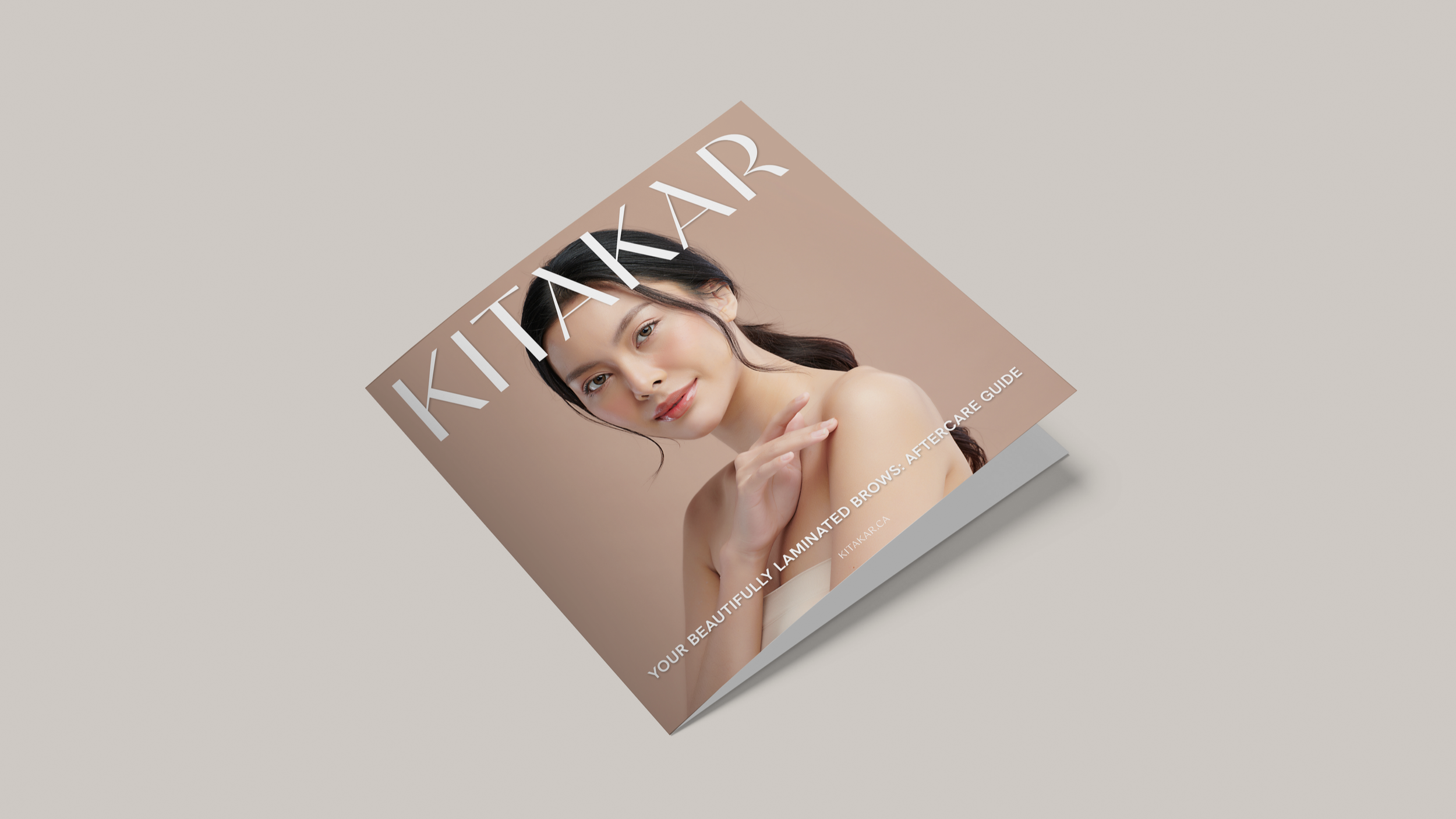
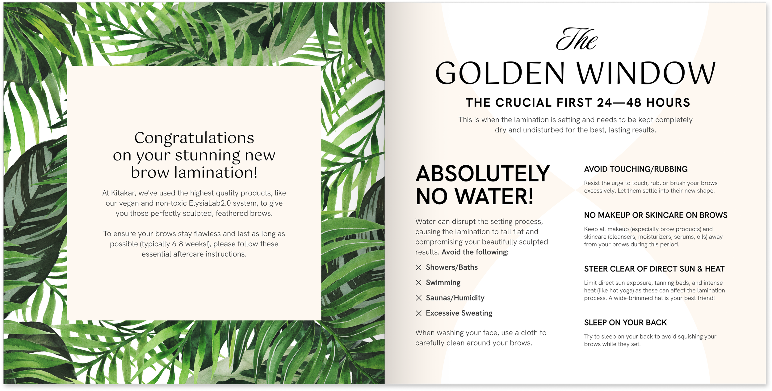
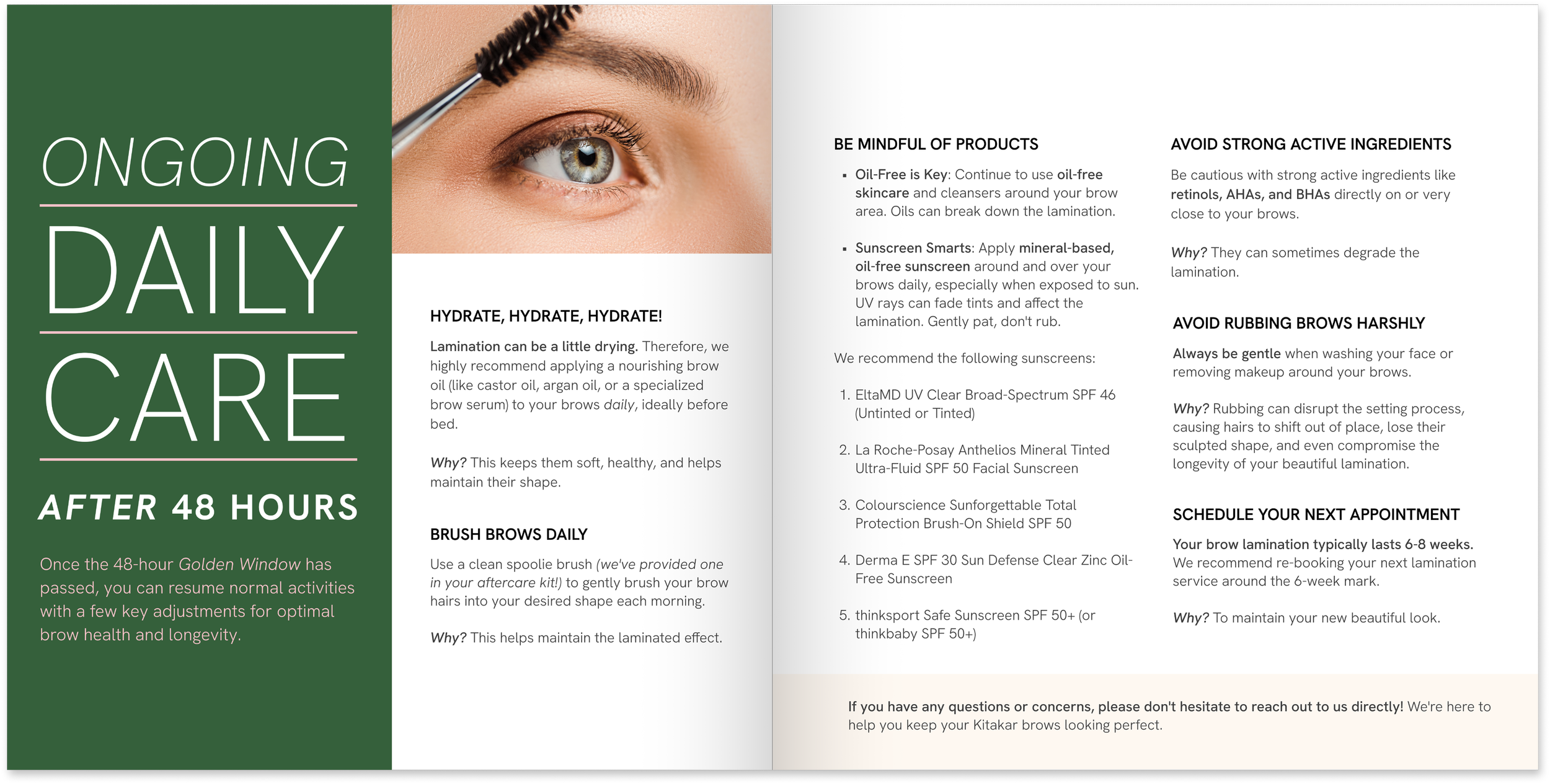
💞 aftercare booklet
Purpose: provided to clients post-service to inform clients with care instructions for safe and sustainable results
Considerations:
Print versions can given or used to further educate
Digital aftercare instructions can also be sent through email (optional)
🔎 Retrospective
My goal for this case study was to highlight how focusing on key flows and nurturing client relationships through value-driven content and optimizing experiences in an organized and intentional way drives a business to stand out in a competitive market where clients are not only looking for services, but also genuine connections.
Authentically engaging with clients in a purposeful and professional manner as a small business is what keeps clients loyal. A booked service can transform into a relationship or influence when positioned and marketed strategically.